ANSWERS
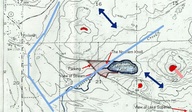
I. Topographic maps use contours to show altitude for various 2-D (EW and NS) positions. Here is an example:
QUESTIONS:
On this map locate a local maximum of altitude (hilltop): THREE RED AREAS, THE TWO UPPER ONES APPEAR TO BE ABOVE 1500 FEET
a local minimum of altitude: LESKINEN LAKE (THAT'S WHY WATER COLLECTS THERE)
a valley: THICK BLUE LINES MARK A VALLEY JUST BELOW 1300 FEET AND SURROUNDED BY 1300 FEET CONTOURS
a steep hillside: THICK PINK BAR DOWN TO THE RIGHT FROM THE RIGHT MOST PEAK (CONTOURS TIGHTLY SPACED)
and a pass between two valleys: TWO DOUBLE HEADED BLUE ARROWS, TOP ONE CONNECTS 1350' CONTOURS BETWEEN 1400s; BOTTOM ONE IS AMBIGUOUS, REQUIRES ASSUMING THAT THE COMMUNITY HALL CONTOUR IS 1300', NOT 1400'.
Does Leskinen Creek flow Northeast or Southwest? PROBABLY SOUTHWEST
How do you know? OTHERWISE THE LAKE WOULD BE A DEAD END, AND IT RAINS A LOT IN MINNESOTA. THIS IS NOT PROVEN, HOWEVER, SINCE IT IS NOT CERTAIN WHAT HAPPENS TO THE LESKINEN CREEK VALLEY OFF THE BOTTOM OF THE MAP. IF THE 1300' CONTOURS JOIN, THE CREEK WOULD RUN INTO THE LAKE. PROBABLY IT CONTINUES TO LAKE SUPERIOR.
II. Weather maps use contours to show pressure for various 2-D (EW and NS) positions. Here is an example (you can find an updated one by clicking here):
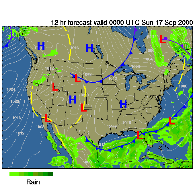
The white numbers denote atmospheric pressure in millibars (1000 mbar = 1 atmosphere)
QUESTIONS:
On this map use the contours to locate a local maximum of pressure: SOUTHERN INDIANAa local minimum of pressure: NORTHERN WYOMING (though without the L it would be hard to tell whether it is high or low, because it is not numbered. Compare with the H over Colorado)
NOTE THAT THE TOPOGRAPHICAL TERMS BELOW ARE BEING USED METAPHORICALLY
a "valley": ARIZONA INTO MEXICO probably. Rising from 1008 on going either east or west. The closed contour over Gulf of California is unlabeled and ambiguous as to whether it is 1010 (a maximum) or 1006 (a minimum).
a "steep hillside" (where winds should be high): CONTOURS CLOSE TOGETHER IN WESTERN WASHINGTON
a "pass" (or "saddle-point" or "potato chip") joining two regions of low pressure: CENTRAL MINNESOTA (1008s connected between 1012s)
What do you think of the positioning of H and L ? IT IS CURIOUS THAT THEY ARE NOT CENTERED ON INNERMOST CLOSED LOOPS. THIS MAY REFLECT A SLOPPY PLOTTING ALGORITHM
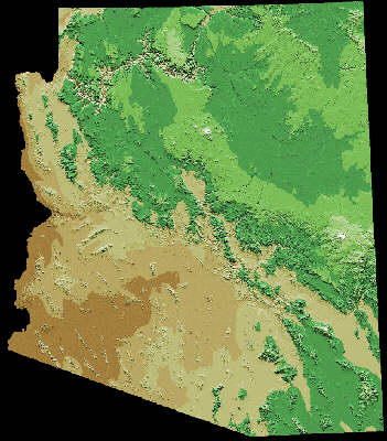
III. There are alternatives to contour lines for coding electron density, or vegetation cover, or annual rainfall, or altitude, or whatever:
|
QUESTIONS: How is the 3rd dimension coded in this graph? BY COLOR |
|
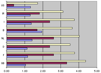
IV. Here is a very different kind of 3-D graph.
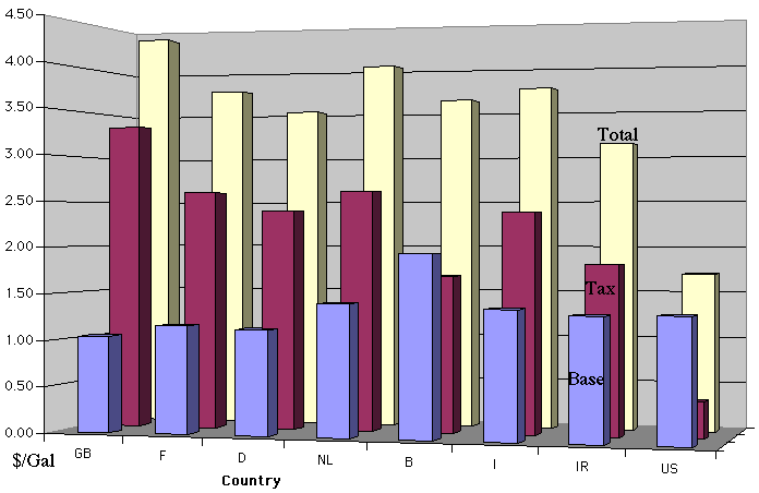
QUESTIONS:
What are the dimensions? COUNTRY, COST PER GALLON OF GASOLINE, COMPONENTS OF THE COST (material, tax, total)How is the 3-Dness conveyed? BY USING CONVENTIONS OF PERSPECTIVE (SHADING AND VANISHING POINT)
How might you use a different method to present the same information? COULD PRESENT AS TABLE OR SIMPLE BAR GRAPH
Country
Base
Tax
Total
GB
1.04
3.33
4.37
F
1.16
2.60
3.76
D
1.13
2.39
3.52
NL
1.41
2.61
4.02
B
1.94
1.69
3.63
I
1.37
2.38
3.75
IR
1.31
1.82
3.13
US
1.32
0.39
1.71
Which presentation is simpler? TABLE WOULD BE THE EASIEST TO GENERATE. COUNTRY ROWS COULD INCLUDE ANY INFORMATION WE WANT IN COLUMNS (COLOR, BRAND OF GASOLINE, POPULATION, ETC.)
Which is clearer? BY CLEAR SORTING, THE 3-D GRAPH MAKES IT EASIEST TO PERCEIVE HOW GOOD WE HAVE IT IN U.S. WITH RESPECT TO GAS TAX. INTERESTING THAT THE FUNDAMENTAL COMMODITY IS CHEAPEST IN GREAT BRITAIN, BUT TAXES MAKE IT MOST EXPENSIVE. THIS IS WHY TRUCKERS CRIPPLED TRAFFIC IN LONDON LAST WEEK.
|
|
|
|
Comments on this page are welcomed by the author.
J. Michael McBride
Department of
Chemistry, Yale University
Box 208107, New Haven, CT 06520-8107
e-mail: j.mcbride@yale.edu
text copyright © 2000 J.M.McBride